Friday, September 21, 2012

Research: Leather Dye


One of the more interesting aspects of bookbinding is constantly experimenting with various techniques to decorate or customize the covers. One of the techniques that I like to use is wood burning. I'm still experimenting with the new tips that I picked up but have been working with pressure and how slowly to move it across the leather to get a darker (or lighter) mark.

Additionally I wanted to see how the technique would look once I dyed the leather (as opposed to dying the leather and then burning it). So I grabbed a bit of 4 oz leather and started to experiment.

Dying leather is a tricky process. Leather dye is always futzy when you're trying to get an even coat or wash across the surface. Normally I end up with brush marks or sponge marks left from the areas where the dye was stronger in some places and weaker in others.  The above test strip was an experiment with various acrylic washes to see how well they would color the leather.

Copper (left) and brown (right)
The copper looks interesting. It does keep its metallic sheen to it once it dries so that's something to keep an eye on. I could always use it to accent something like a central design. I wouldn't use too much of it because it would become overpowering in the overall theme of the book.

Blue (left) and Orange (right)


The blue is a nice, rich color. I could easily see it being used to color an entire book. I know a few people who would love a "River Song" journal from Dr. Who. The orange (see below) came out very nice and would look awesome for some kind of autumn-themed book.


Book: Chinese Copper

When I experiment with a technique it doesn't always work out for the best. Sometimes the process, the materials or even the idea is just so wonky that it doesn't want to work out. So when I get an idea to experiment with some new aspect of binding I usually fall back to the trusty composition notebook. Yes, those cardboard-covered notebooks that you can get from the dollar store make excellent test subjects.

Take this recent experiment with the concept of a 'Triple Fold'.  I have made Double Fold books several times and I have been asked if I could ever make a book with three sections. Since I wasn't sure how it would work - or if people would actually want a book with three different sections to it, I decided to give it a go.

The three books are bound one to each other in a long, continuous section so that the inner-most book is hidden within the second book which is then turned inward against the first. Structurally this allows the author to divide their subjects into three separate areas of focus. It could be daily notations, experimental notes and then formulas, for example.

The cover was created by covering the whole book in a layer of brown, kraft paper to give it a single, uniform 'skin'. The skin was then given a coat of green paint to kill the dullness of the natural kraft paper. Once dried I added yellows and browns with sponge painting and then added some copper highlights. I then added some raised elements on the front cover and sunk-in some Chinese-looking scrap booking embellishments to complete the look. The disk item in the center swivels to reveal an open space below where one might put a photo or some other type of decoration unique to the author. The book has no closure because I couldn't think of one that would go with the design. Estimated value: 10-20 dollars.

Thursday, September 20, 2012

New Technique: Cord Binding

A cheap way of binding up small pamphlets or booklets is to string a thick cord through the pages to keep them together. The technique, called 'Cord Binding' is not designed for large books but could easily be used for booklets up to fifty pages or so.

New Technique: Laminate Paper Cover

Since most of my experiments use cheap, composition notebooks I don't worry about completely wasting the materials involved. I try and use the cheapest materials to see if the idea will work first and then, once the theory has been proven, try it with better quality materials.

A new technique in creating covers occurred to me and I wanted to try it out. The technique involves covering the boards of the book with multiple layers of thin paper, building it up with washes of glue to fill in the nooks and crannies. The idea, shown right, creates folds and imperfections in the cover which I think add to the overall look. The more of those folds and things the better.

I didn't go crazy with the folds but I could have spent an hour crimping and roughing the paper to make the new texture more pronounced.

 Once I had two layers down and let it dry for a while, I came back and started adding paint to cover over the original material and so that the composition cover couldn't be seen through it.

I will be going over the black layer with lighter and lighter shades of paint to highlight the folds and new texture of the cover.

Pics to follow.
The first layer of black paint to give it a good base.
Sponge-painted, the cover starts to look less like composition notebooks and more like a real book.

 Once I had the book painted and sealed with a layer of pva (polyvinyl acetate) I wanted to add a closure to it. Unfortunately the only ribbon I had was blue but I don't think it looks too bad.

The cover is set with a raised 'picture window' where the author could place a title or subject card to tell what the contents of the book were.

As this was an experimental book I didn't get too fancy with the shape of the title box but it doesn't look too bad; almost like an old lab manual. 

Monday, September 17, 2012

PROJECT: Tree of Life

Update: 9.17.12

The Tree of Life basic shape is still an idea for a simple book. I may try and cut out the shape of the tree and try it as a raised image to see how it would look covered in paper rather than in leather.


Original Post: 7.15.11

For one of the next books that I'm making, I wanted to try a new design for the front cover. The book is going to be a Double-Fold, size 5, book with a section of white pages for the main book and black pages for the interior, or secondary book.

The front cover will have a raised element of a tree-of-life with the hollow sections revealing either glass or some kind of 'glossy' material. I'm not sure if the sub-surface color will be black, white or green but I sketched up some ideas (right) to see what it would look like.

I really liked how numbers 1 and 4 turned out because it left a lot of empty space that I can use to show off the tree design that's raised. Number 1 is very stylistic and you have know that you're looking at a tree to realize what the design is (in my opinion). Number four has a lot of the 'tree' qualities that I'm looking for in the design and there's no mistaking it for some other shape when it's raised off the front of the book's cover.

The problem is that it's asymmetrical and I generally like my books to look 'balanced'. Additionally, the thin 'branches' on the side would probably not stand up to the wear and tear that most of my books are put through so I would need to fatten them up for a finished design.

Since I wanted to keep the design from #4 but add some thickness to the branches, I took concept and re-drew it and then mirrored it so that it would be symmetrical. The shaded areas would easily show the green or black backing material that I had in mind although I might thin down the top of the trunk a little.

Additionally, the surrounding 'ring' of the tree design will be given an added later to bring it out as a design element on the cover and I need to stretch the design of the tree to make it more ovoid than a flat-circle. So I needed to scan in the image and play with it in Gimp a bit to figure out what kind of variations I could try with the colors and design.

Once I had plenty of variations with the color of the tree, background and possible cover I couldn't decide on what version I liked better so I put them together in a concept-design video. I had been meaning to implement this on some of the bigger projects, documenting the whole process by which a book was created so that future clients could see the design process as well as what types of elements were possible.

Design: Stag-Tree


This is a combination design using the "Black Stag" head as well as a modified "Tree of Life" design.

Design: Black Stag Head

A new cover design idea for either a hard-cover or leather-covered book. I'm thinking that the design, burned or pressed into leather with a green background would look awesome.


Update 9.17.12

I think that the design would be perfect as an image burned into the surface of a leather book. I'll probably paint or stain the design to make the negative image pop off the cover. 

Monday, July 2, 2012

Project: Three Keys

Name: Three Keys
Size: Size 5, Double Fold
Cover: Leather Cover
Cover Material: Black Leather
Pages: 600 (approximately)
Paper: 75 lb
Elements: Two buckles on cover flap, book ribbon,
Estimated Value: $100.00

Description: A size 5, double-fold journal with a depressed design of a pentagram and three skeleton keys on the outer cover.

Discussion: 

So I need to create an image of a pentagram with three skeleton keys at the base. 

This will fit onto the front cover of the book as a recessed image (where the image is sunk into the cover board)

The whole book will be closed and sealed with a flap on the back cover and two brass buckles to hold it closed as I did earlier with the Paladrym.


So when it's finally finished the book will look something like this: (with a black cover)


Update: 6:25.12

Work and finding an alternative source for grey board has taken it's toll and I was only recently able to finish the body of the book. I still have yet to mount the buckles and straps on the cover but I am going to show it to the client tomorrow to get his input for where he wants them.

I forgot how labor-intensive double-folds can be. :)

Pics to come.

Update: 5.30.12
I've finished the exterior cover for the book - the shaded areas will be carved out in the next day or so.


Update: 5.29.12

Secured enough grey board for the cover and have sewn up the secondary book. Now all I have to do is layout and carve the symbol, build the buckles and start assembly.  


 Update: 7.2.12

DONE.

I've delivered the 3-Keys to its new owner who has promised that he will tell me the Book's name when it's revealed.


Tuesday, June 12, 2012

Design: Owl Spine


I've always wondered about adding a design to a book that wrapped around the entire cover. I remember seeing some journal cover a while back that had a large Celtic tree that was centered along the spine. I thought that I could do the same thing.

 The cross-hatching in the background would require a fine-bladed wood burning tool to keep it from looking too 'mushed' I would think.

To wrap around a journal of dyed pages of mixed colors (green and brown) I thought about making an Autumn-themed book and I wanted to include my new 'spine-animal' design.
I would probably use a tie-closure for this design.


Design: Serpent-Cup

Over and over again I am trying to add symbols for book-cover designs. I think the above design was made years ago and I've still not put it on a book.

The symbolic elements are:

Snakes entertwined: Snake = Rebirth, Regrowth. Knotted = Bound, connected, etc.

Cup = Female. Life. (Holy Grail-ish), Plenty, etc.

Sun/Moon = Balance between male and female.

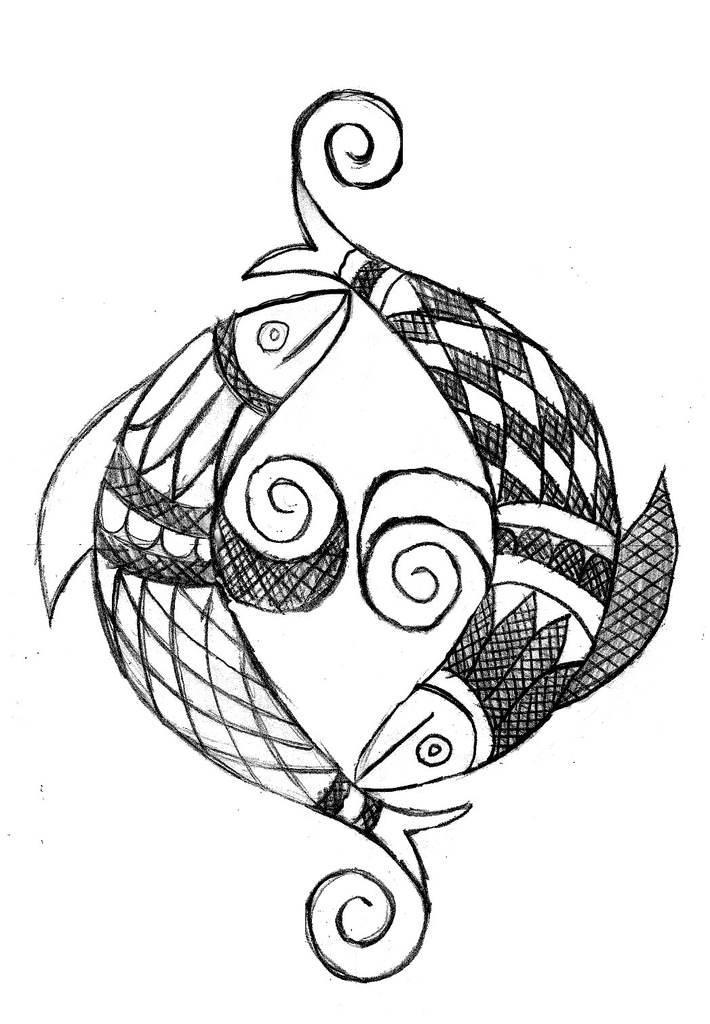
Design: Fish Yang


A friend of mine once asked if I could make a yin-yang symbol out of fishes. Don't ask - it's complicated.

I think this design would be great as presswork into a leather journal using additional dye to bring out the darker portions.


Update: 5/13/13
This design was put on a ledger-sized, all-leather book cover. (Click Here)

Design: Moon Wheel


This is a design that I've done over and over again as a possible cover for a book. I think that I would either press the design into the leather and then color it with dye to bring out the lines and different phases of the moon.

The only problem with the design is that it really needs something at its center. I could always put in a tripple-moon or a pentacle or something depending on what the client wants.

Friday, June 1, 2012

Newsboard

Newsboard is a form of compressed cardboard often made from recycled newsprint (thus the name). it is commonly used in matting pictures, mounting or backing artwork, etc.

I use it for the covers of my books as it's affordable and easy to work with since it comes in 1/4th inch thickness.

However - my main supplier has "chosen" not to carry it any longer so I'm on the hunt for a new source. Unfortunately I have several projects that require a lot of it (double folds take 3 boards alone).

More when I find a better source.
-Tom

Sunday, May 27, 2012

Book: Green Scale Brick

Name: Green Scale Brick
Size: Size 1, Brick
Cover: All Leather
Pages: 500 (approxi)
Paper: 75 lb
Estimated Value: $20.00
Description: The Green Scale Brick is an all-leather cover, size 1, "Brick" journal with a tie closure and press work and leather dye elements.

Process:

Bricks are one of the easier journals for me to make and the design is something that I use for experimentation in covers. There's not a lot of cover material in a size 1 journal so I can afford to try new stuff. the different between a size 1 journal and a 'brick' is the number of pages. Bricks will have double the number of pages for an average size journal. For this project the pages are 75 lb, heavy weight 'construction paper' that takes ink, charcoal and paint very well.

Once I had the book block (the bound section of pages) finished and dressed (the edges were cut and the spine rounded), I cut out a piece of 2-3 ounce Craftsman Tooling Leather (from Tandy Leather) and started to lay out the basic space I would have to experiment within.

The design for this book started with a simple, quarter-inch border around the cover. It creates a 'framework' in which I can plug any design I want. Once I had the border lined, I added small dots with one of my leather stamps to break up the empty space of the border.

Then I wanted to get into some cross-hatching for the cover and see what would the effect be with such thin leather.

As you can see, Bricks are wide books. This one measure around 2 inches thick.

Normally I use 3-4 ounce leather for my books but wanted to try something thinner to see what would happen. Once the grid was put onto the cover and pressed, I started work on the dye process.

Leather dying is a pain. It's the one 'random' factor in making a book that I'm still working on. For this project I wanted to see if I could marble the leather to give it a mottled, lizard-like quality and I think I've achieved it. I left the outer edge the base 'green' color that I used as a reference for what I had to start with when I began altering the colors of the main body.

Once I had the cover dyed and marbled the way I liked it, I added a simple, string closure (mainly because anything too thick would stand out along the center of the book so I kept it thin) that one could tie closed.

For end-papers, I'm experimenting with marbling colored paper. I think it looks need and is kind of cool for a green-covered book.


Saturday, May 26, 2012

Wicker Tree Symbol


 So I was  at Walmart and saw a DVD title that caught my attention: The Wicker Tree. It is the sequel to the original Wicker Man movie back in the 1970's with Christopher Lee. The symbol on the front of the DVD cover caught my attention as an interesting combination of the sun-and-face design along with a pentacle.


So I decided to do a search for the image and found something that I could start with. I didn't want to use their versions because it's full of inverted crosses and that's hard to do as background filler in presswork for a leather journal.

I sketched out half of the design (since I would simply duplicate that half to make the whole) and scanned it in. When I combined the two halves together it made a weird... crown-ish design at the top. The wavey sun-rays should spiral around the sun in the same direction (and I planned on fixing that) but the image with the central 'crown' thing just looked interesting.


But I still wanted to see what the image looked like with the radial sun-bursts going in the right direction so I fixed it and decided to add some color for the wavy lines. In the finished design for the book, I'll simply press the entire shaded area and dye it darker.
But - since the book would not be white I wanted to see what the black on stained-leather would look like and knocked together a quick representation of the different looks.


I'll post finished progress pics once I start working on it.

Tuesday, May 1, 2012

Term: Double Fold

Name: Double Fold
Size: varies but often Size 5
Cover: Leather or All Leather
Pages: 600 (approximately)
Paper: 75 lb
Elements: Varies but often will include Decorative Symbol (Raised or Recessed), Book Ribbons, Buckle closures, etc.
Estimated Value: $50.00 

A Double-Fold book is essentially two books bound within the same cover. Books such as these have been used for a myriad of purposes but were popularized in the movie, Practical Magic, as a Book of Spells. One of the books was for the 'good' spells and the other was for the 'bad' spells.

Double-Folds can be of almost any size (1-5) but are commonly made 'big' (size 5) because people wish to pour plenty of work into each page and need the additional space. Some have opted for a smaller version and gone with a smaller size but that is a matter of personal preference.

When designing a double-fold book there are a lot of terms and elements that need to be discussed (the cover material, any design that might be added and upon what cover will it go, etc.).

To make things easier for those people who want me to make them such a book I've tried to keep the terms fairly simple.

The cover for a double-fold is much larger than a standard book as it has to wrap around two separate blocks of pages. 
 It's important to note where a client wants a symbol or image place so that mistakes aren't made in the construction process. Additionally - images on the Interior covers have to be RECESSED as opposed to RAISED because the raised image will press into the pages of the Primary Book.

Double Fold books are divided into two sections: the Primary Book and the Secondary Book. The Primary book is usually the thicker of the two sections (usually 2/3rds of the total pages) and is the book  that one first sees when they open the book. The Secondary book is often thinner or equal to the Primary book (the distribution of the pages can be equal - it's a matter of the client's wishes) and is often where the author will keep 'reserved' information.

In the case where books such as these were used by the medical profession in the 16th and 17th century, the Secondary book was a book of known cures; things that the physician knew worked as treatments for various maladies. Essentially the Secondary book was the 'Physician's Desk Reference' of the time. The Primary Book was a written record of all of the cases that he had come across in his work. It would most closely be associated with a the charts and medical histories kept by the medical profession on their patients.

For my "Standard Double-Fold" I will often encourage the client to pick a symbol for the Exterior cover of the book - something that's meaningful to them. Normally I will try and keep the design down to an inch-shorter than the dimensions of the exterior cover. So an 8.5" x 11" cover would have a design space of 7.5" x 10". It's just easier to fit the design into the space allotted.

The only problem is when someone wants to add buckles to the book - the design space will shrink as the buckles attach to the Exterior Cover in two or three places and that can either A) shrink the design to near obscurity or B) move the design to the Interior cover.

Other binders or book suppliers charge STUPID amounts of money for their versions of Double-Fold books.

Studio Lapulia: $635.00

Term: Raised Design

A design element often used in leather or all-leather book covers.
The image is pushed  up from the surface of the book making it thicker.